Most of us want big open kitchens with connected living space. Oftentimes, to achieve this goal, walls are opened up or removed entirely, and the kitchen footprint is expanded. But what happens when that’s not possible? We found out when we recently tackled a total kitchen remodel in a small space. Here’s how we delivered high design and functionality, in a small space.
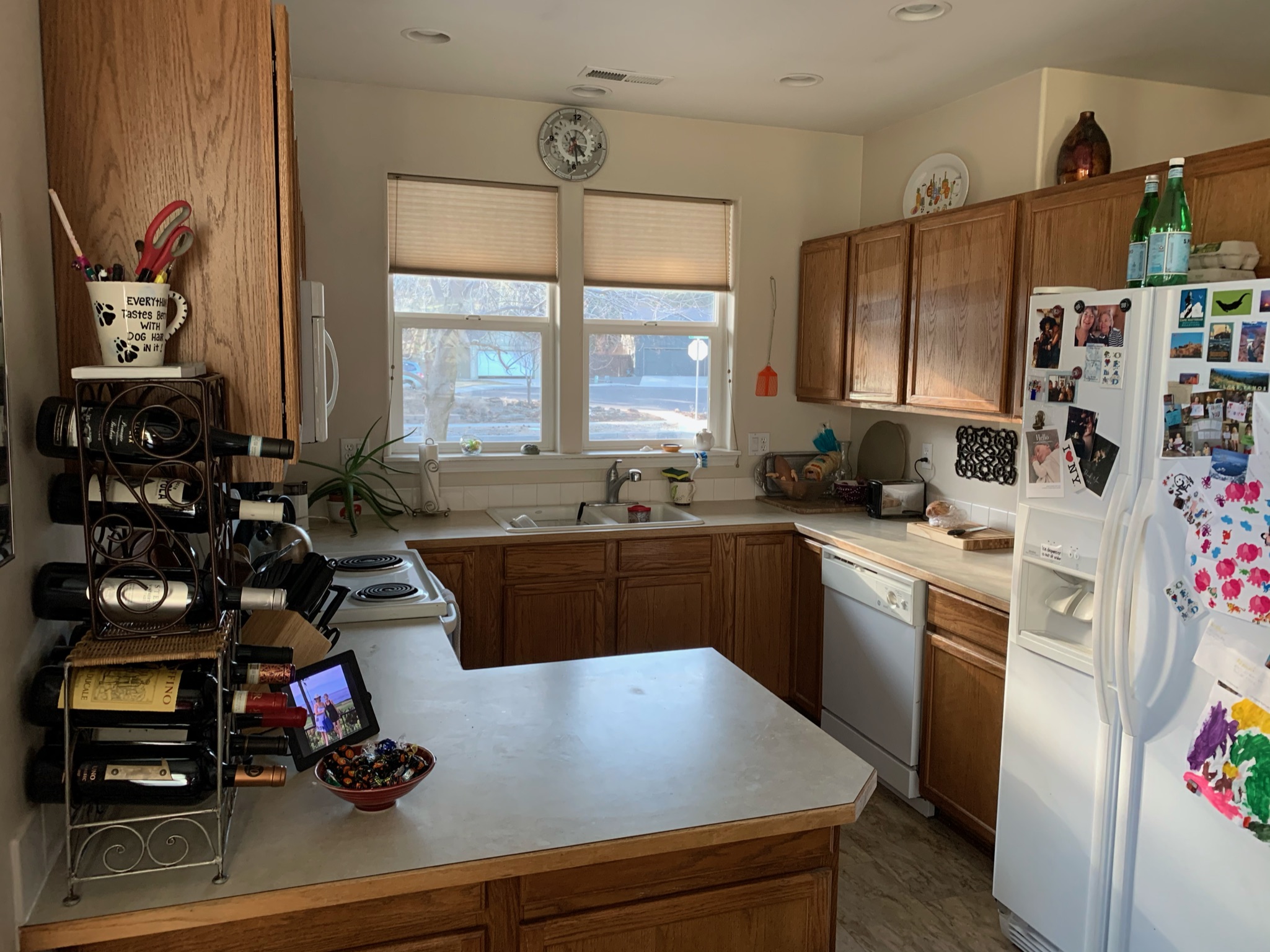
The Before
As you can see in the before picture, we had a very small area to work with. There was limited storage, and the space was dark and dated.
Create More Space
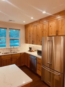
We created more space and drama by eliminating the bulkhead above the upper cabinets and running new updated cabinets all the way to the ceiling. We added even more functionality by installing two new lazy Suzan cabinets in the corners of the kitchen that before was just dead space. And the dead space in the peninsula was transformed into usable space by adding an additional cabinet.
Lighting
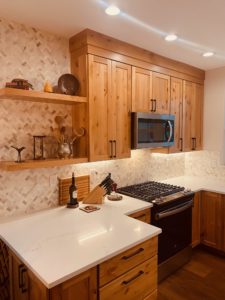
New can LED lighting was installed as well as LED under cabinet lighting. We added a new chandelier in the adjacent dining area to brighten that space. These small changes made a huge difference in the end result, transforming a dark area into a well lit space, making the footprint of the kitchen appear larger.
The Wow Factor
We surrounded new floating shelves with a natural mosaic stone backsplash that we ran all the way to the ceiling. New modern appliances were installed as well as a brand new LVP floor. A beautiful, creamy, quartz counter top was installed, giving the final look of the newly remodeled kitchen serious eye appeal. The new kitchen, had more storage, and functionality, but had the exact same layout and square footage as before. It goes to show that design can go a long ways when you are short on space in a remodel. I think you will agree after looking at the after photos below, that this kitchen really is small but mighty! 


